以前、WordPressテーマの「Simplicity」に「AMP」ページへの遷移を促す要素を表示する方法をご紹介いたしました。

次はもっと自然に「AMP」ページへの遷移を促したいと思い、ローディング画面を表示してその範囲内に表示してみました。
js
ローディング画面用のjsは下記のようになります。
// ローディング
jQuery(window).load(function(){
  jQuery(".js-loading").addClass('is-fadeout');
  setTimeout(function(){
        jQuery(".js-loading").addClass('is-hidden');
    },200);
});
上記のスクリプトを「loading.js」などとしてファイルに保存し、「Simplicity2」の子テーマの「simplicity2-child」内にアップロードします。
single.php
ローディング画面はモバイルだけに表示したいので、「Simplicity2」で定義されている「<?php if (is_mobile()) :?>」でhtmlを囲みます。
<?php if (is_mobile()) :?>
  <div class="js-loading c-loading-box">
    <svg id="sprite" xmlns="http://www.w3.org/2000/svg" >
      <defs>
        <symbol id="svg-amp" viewBox="0 0 32 32">
          <path d="M16 0C7.2 0 0 7.2 0 16s7.2 16 16 16 16-7.2 16-16S24.8 0 16 0zm1 3.6l-2.4 10h8l-8.4 14.8 3-10.8h-8l7.7-14z"/>
        </symbol>
      </defs>
    </svg>
    <a href="<?php the_permalink(); ?>amp/" class="amp">
      <svg>
        <title>amp</title>
        <use xlink:href="#svg-amp"></use>
      </svg>
    </a>
    <i class="c-loading-box__spinner fa fa-spinner"></i>
  </div>
<?php endif; ?>
適用している「AMP」は記事ページのみなので、上記のソースを「Simplicity2」の「single.php」に貼りつけます。私は「<?php get_header(); :?>」のすぐ下に貼りつけました。
mobile.css
ローディング画面はモバイルの画面サイズだけに表示したいので、子テーマの「mobile.css」で「media screen」を指定し、スタイルを記述します。
/*****************************************************
** media screen
*****************************************************/
@media screen and (max-width: 500px) {
    /************************************
    ** ローディング画面
    ************************************/
    .c-loading-box {
        display: block;
        width: 100%;
        height: 100%;
        position: fixed;
        top: 0;
        left: 0;
        z-index: 9999;
        text-align: center;
        background: #fff;
    }

   .c-loading-box__spinner {
       font-size: 88px;
       display: inline-block;
       color: #f1f1f1;
       -webkit-animation: rotateThis 1s linear infinite;
       animation: rotateThis 1s linear infinite;
   }
   @-webkit-keyframes rotateThis {
     from {-webkit-transform:scale(0.5) rotate(0deg);}
     to {-webkit-transform:scale(0.5) rotate(360deg);}
   }
   @keyframes rotateThis {
     from {transform:scale(0.5) rotate(0deg);}
     to {transform:scale(0.5) rotate(360deg);}
   }

   .c-loading-box.is-fadeout {
       opacity: 0;
       -webkit-animation: fade-out 0.1 fade-out;
        animation: fade-out 0.1 fade-out;
   }

    .c-loading-box.is-hidden {
        display: none;
    }

    /* amp */
    #sprite path {
        fill: #eeac00;
    }

    .c-loading-box a.amp {
        display: block;
        position: relative;
        margin-top: 50px;
        padding-bottom: 20px;
        text-decoration: none;
    }

    .c-loading-box a.amp:before {
        position: absolute;
        left: 0;
        right: 0;
        bottom: 0;
        content: 'すぐ読む';
        color: #eeac00;
    }

    /* fade out 100% */
    @keyframes fade-out {
        0% {
            opacity: 1;
        }

        99% {
            opacity: 0;
        }

        100% {
            opacity: 0;
        }
    }
    @-webkit-keyframes fade-out {
        0% {
            opacity: 1;
        }

        99% {
            opacity: 0;
        }

        100% {
            opacity: 0;
        }
    }

}
「Simplicity2」の設定で「レイアウト(全体・リスト)」にある「タブレットはモバイル表示」のチェックを入れていると、タブレットでもローディングが表示されてしまうので、子テーマの「mobile.css」内で「@media screen and」以外の場所に下記の記述をしておきます。
/*****************************************************
** ローディング画面
*****************************************************/
#sprite,
.c-loading-box {
    display: none;
}
上記の記述をしておけば、タブレットでローディングなどが表示されることはありません。
横向きにも対応する場合
ローディング画面を横向きにも表示する場合は、メディアクエリの記述は下記のようになります。
/*****************************************************
** media screen
*****************************************************/
@media screen and (max-width: 500px),
       screen and (orientation: landscape) {

}
上記は「画面の横幅が最大500px」まで、または「画面が横表示の場合」の時にスタイルが適用されます。
footer-insert.php
「Simplicity2」の子テーマ、「simplicity2-child」にある「footer-insert.php」に下記の記述をします。
<?php if (is_mobile() && is_single()) :?>
<script type="text/javascript" src="<?php echo get_stylesheet_directory_uri(); ?>/loading.js"></script>
<?php endif; ?>
「<?php if (is_mobile() && is_single()) :?>」により、モバイルかつ、「single.php(記事ページ)」のみに「loading.js」が読み込まれます。
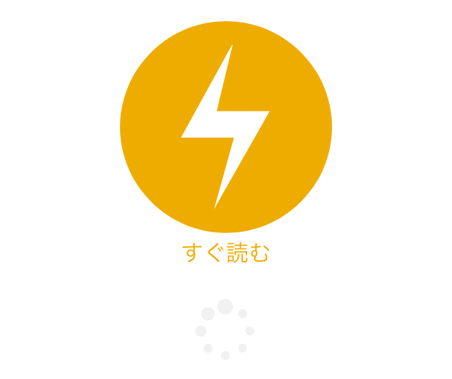
ローディング画面から遷移
モバイルで記事ページへ遷移する際にローディング画面を表示させ、AMPアイコンから「AMP」ページへ遷移します。
まとめ
- ローディング用のjsを作り子テーマの「footer-insert.php」に読み込ませる。
- ローディングとAMP用のcssを作り子テーマの「mobile.css」に貼りつける。
- ローディングとAMP用のhtmlを作り「single.php」に貼りつける。
- 変更するphpのファイルは「single.php」と子テーマの「footer-insert.php」。
- 変更するcssファイルは子テーマの「mobile.css」。
本当はローディング関係ではpjaxを実装したかったのですが、いろいろと壁があったので断念しました。
「Simplicity2」テーマでローディング画面から「AMP」ページへ遷移させたい、といった方の参考になれば幸いです。
コメント